Main UI/UX designer · app and website
Daynero
What you can spend today, and why.
Daynero is an early-stage personal-finance product for people earning their first salary. Its central number answers what is safe to spend today. I am its main UI/UX designer: the public website was designed by me with feedback from the founder, and the app's design system has been through three iterations. The website is live; the app is still pre-MVP.
Full case in preparation: team context, constraints, and publishable outcomes.
What is live
The public product site, as shipped.
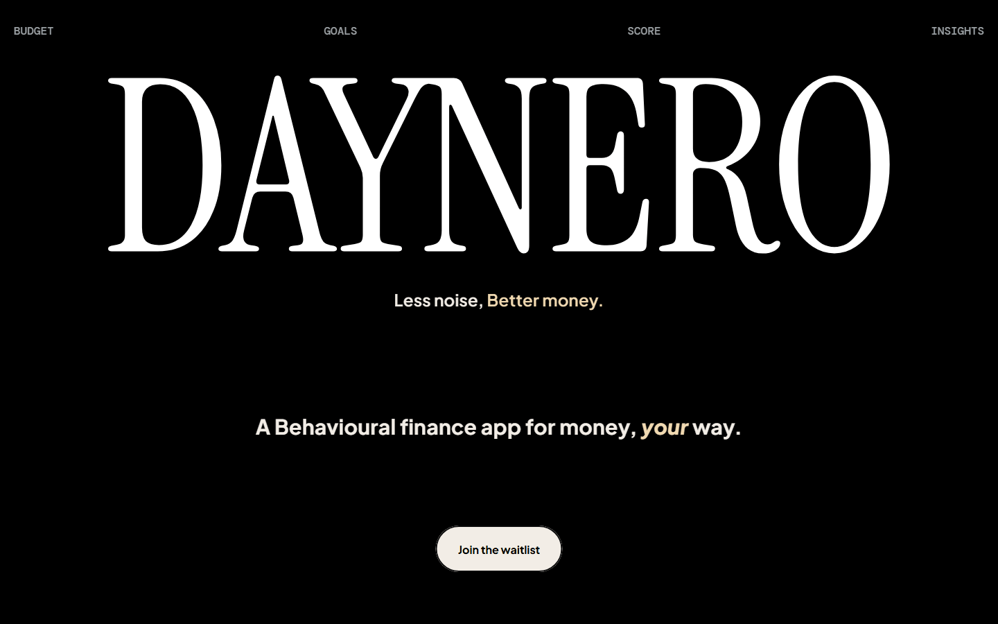
The design work
Approachable for a first salary, credible for money.
The design tension
How do you make a finance app feel approachable to someone earning their first salary, without making it look simplistic or financially unreliable? That balance of clarity, approachability, and a credible financial-product identity at the same time is what the app's design has been working against from the start.
The iterations
The app's design system has gone through three iterations. Each pass reworked the interface's visual foundation: layout, colour, hierarchy, and how the daily budget and recent activity are presented. The most recent version moves the app to a lighter, more editorial home screen, with clearer category colour and the day summarised in one line. The iterations are evidence of a design process in progress, not user validation; the artifacts stay internal while the product is pre-MVP.
The reasoning
Why this case is still a preview.
The situation
Traditional monthly budgets can feel detached from the decisions happening today.
Daynero's public position is that financial guidance should respond to daily behavior and spending patterns rather than only report against a monthly plan.
The full project context, constraints, and evidence will be added when they can be documented responsibly.
The turn
- Where it started
Daynero has a live public website and an app in active development, but its full design story is not yet publishable.
- What changed
Writing the case honestly needs the real team context and constraints, and those are not ready to publish.
- Where it landed
So this page shows the shipped public site and my design contribution, and stops there.
The record
Decisions and open questions.
- A live public website describing the current product position, designed and built by Tanishk.
- The app's product experience designed by Tanishk, including the interaction and visual system across the daily-budget surface.
- The full team, timeline, constraints, process, and outcomes are not yet published.
- No private product detail or unverified outcome is presented in this preview.
Next test
Publish the commercial case with the correct context.
Document the team, timeline, product evolution, interaction decisions, implementation trade-offs, and publishable evidence.
What would countThe final case must make Tanishk's contribution precise without erasing collaborators or inventing outcomes.
This preview uses Daynero's public product language and Tanishk's stated contribution. The full evidence record is pending.